How to use Galileo for Named Entity Recognition?
Discover the Console
Upon completing a run, you’ll be taken to the Galileo Console. The first thing you’ll notice is your dataset on the right. On each row, we show you your sample with its Ground Truth annotations, the same sample with your model’s prediction, the Data Error Potential of the sample and an error count. By default, your samples are sorted by Data Error Potential.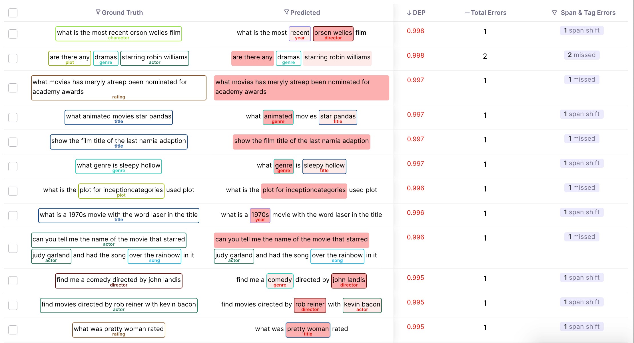
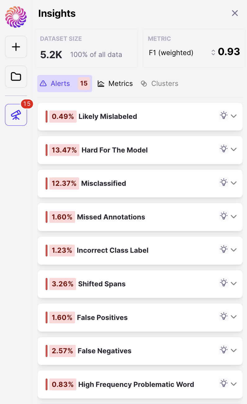
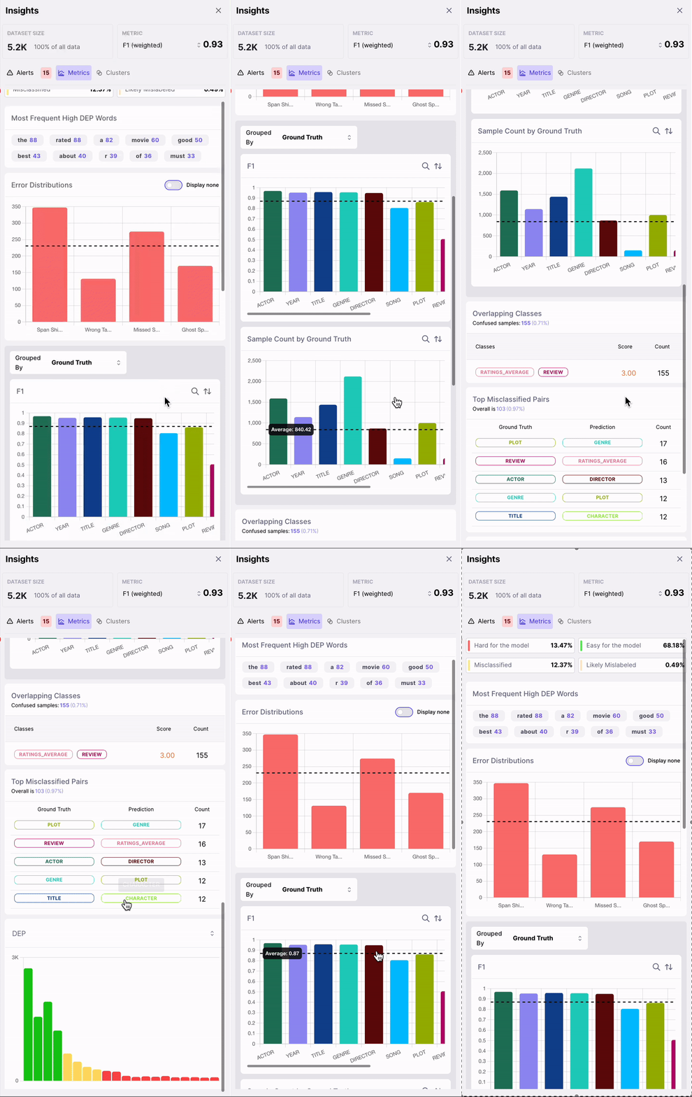
- High Problematic Words
- Error Distribution
- F1 by Class
- Sample Count by Class
- Overlapping Classes
- Top Misclassified Pairs
- DEP Distribution
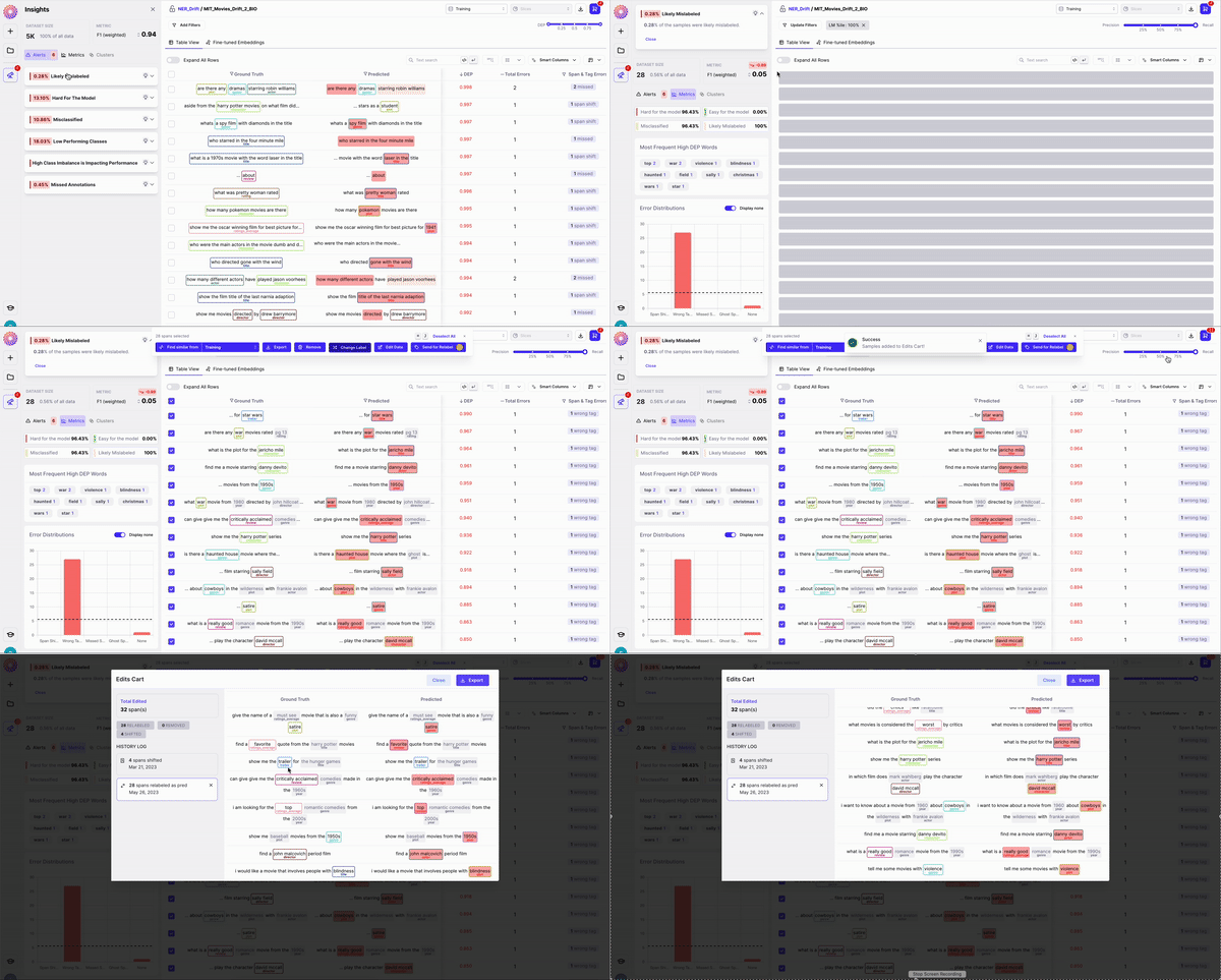
- Change Label - Re-assign the label of your image right in-tool
- Remove - Remove problematic images you want to discard from your dataset
- Edit Data - Add or Move Spans, fix fypos or extraneous characters in your samples
- Send to Labelers - Send your samples to your labelers through our Labeling Integrations
- Export - Download your samples so you can fix them elsewhere

Galileo features to quickly help you find errors in your data
1. Rows sorted by span-level DEP scores

2. Sort by 4 out-of-the-box Error types
Galileo automatically identifies whether any of the following errors are present per row: a. Span Shift: A count of the misaligned spans that have overlapping predicted and gold spans b. Wrong Tag: A count of aligned predicted and gold spans that primarily have mismatched labels c. Missed Span: A count of the spans that have gold spans, but no corresponding predicted spans d. Ghost Span: A count of the spans that have predicted spans, but no corresponding gold spans3. Explore the most frequent words with the highest DEP Score
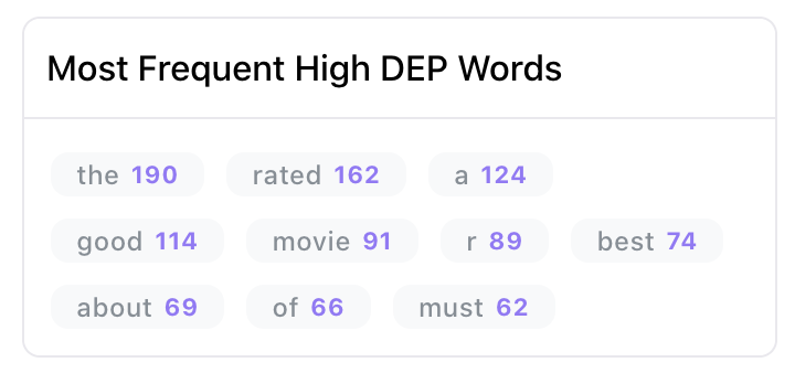
4. Explore span-level embedding clusters
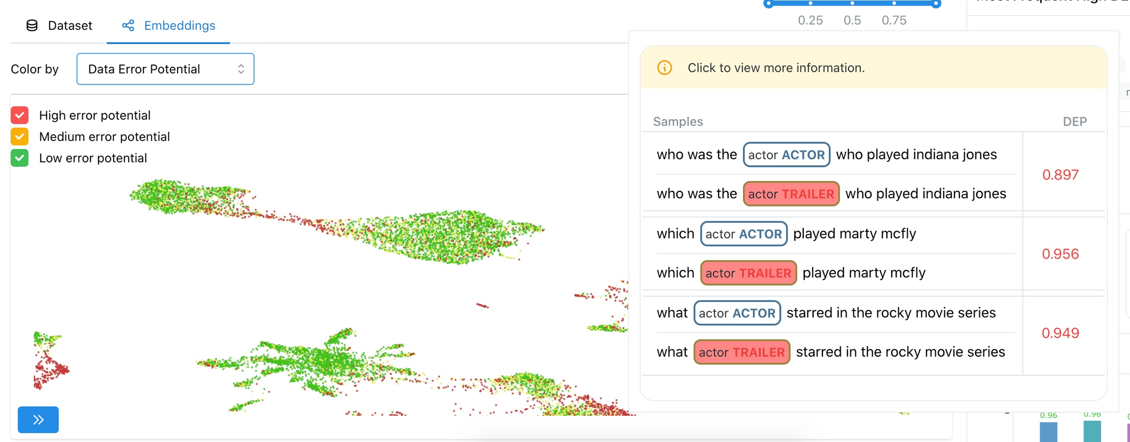
5. Find similar spans
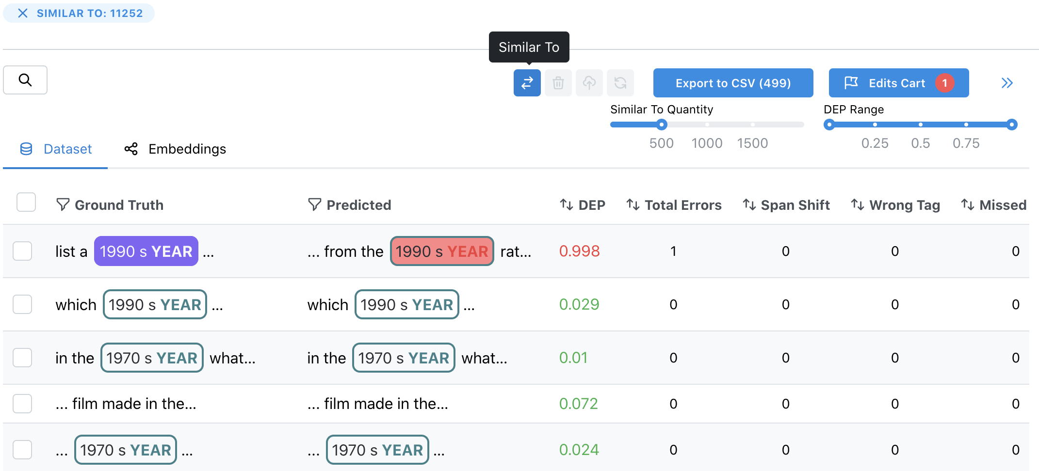
6. Remove and re-label rows/spans by adding to the Edits Cart
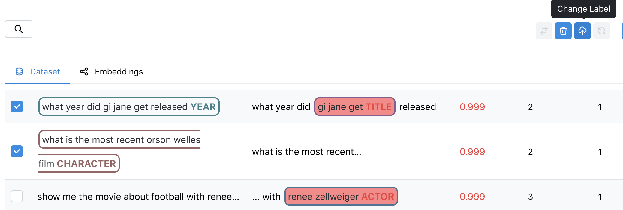
7. Export your filtered dataset to CSV
At any point you can export the dataset to a CSV file in a easy to view format.Types of NER Errors
Annotation mistakes of overlooked spans
As shown in Figure 1, observing the samples that have a high DEP score (i.e. they are hard for the model), and a non-zero count for ghost spans, can help identify samples where the annotators overlooked actual spans. Such annotation errors can cause inconsistencies in the dataset, which can affect model generalization.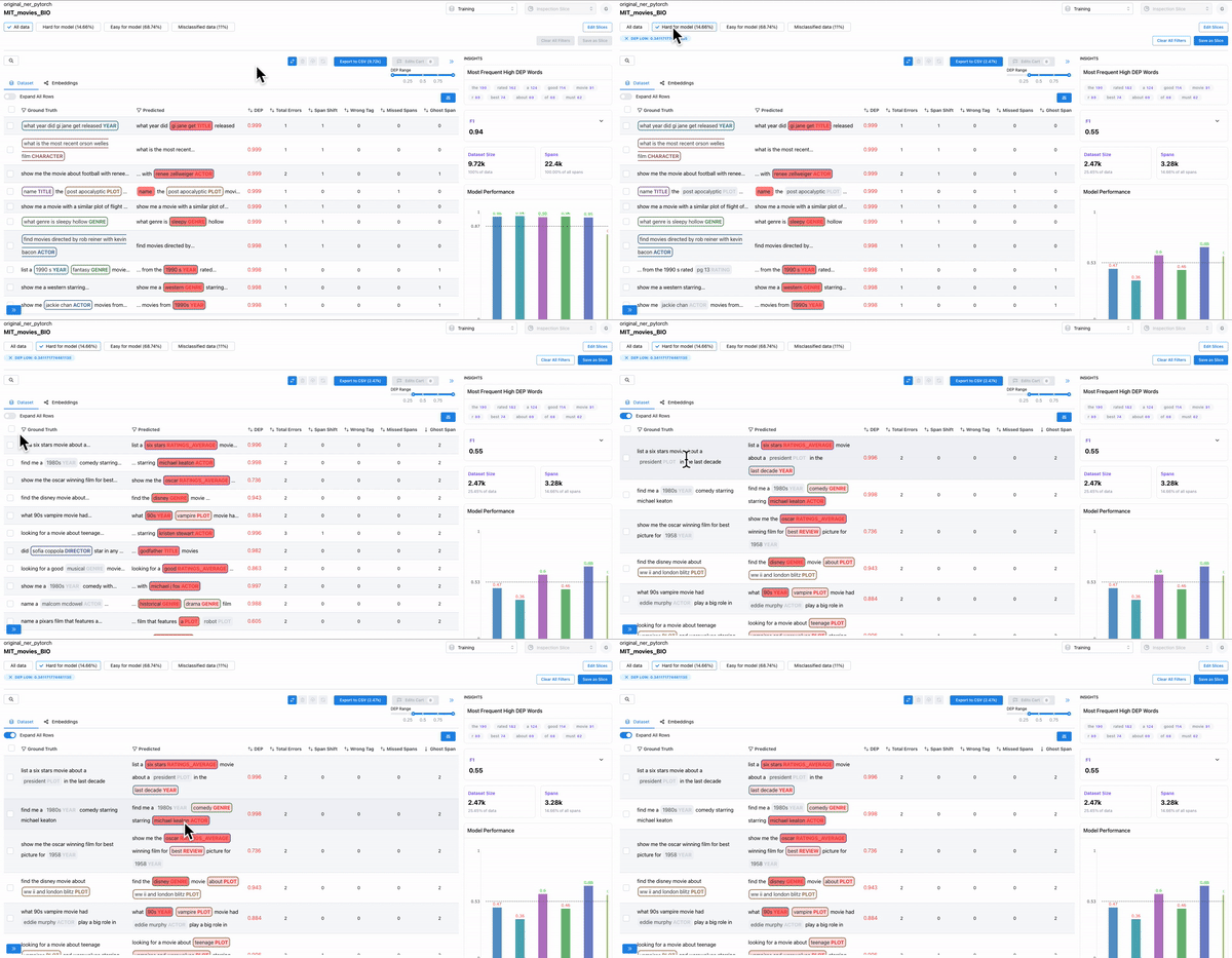
Annotation mistakes of incorrectly labelled spans
As shown in Figure 2, observing the subset of data with span labels in pairs with high confusion matrix and having high DEP, can help identify samples where the annotators incorrectly labelled the spans with a different class tag. Example: An annotator confused “ACTOR” spans with “DIRECTOR” spans, thereby contributing to the model biases.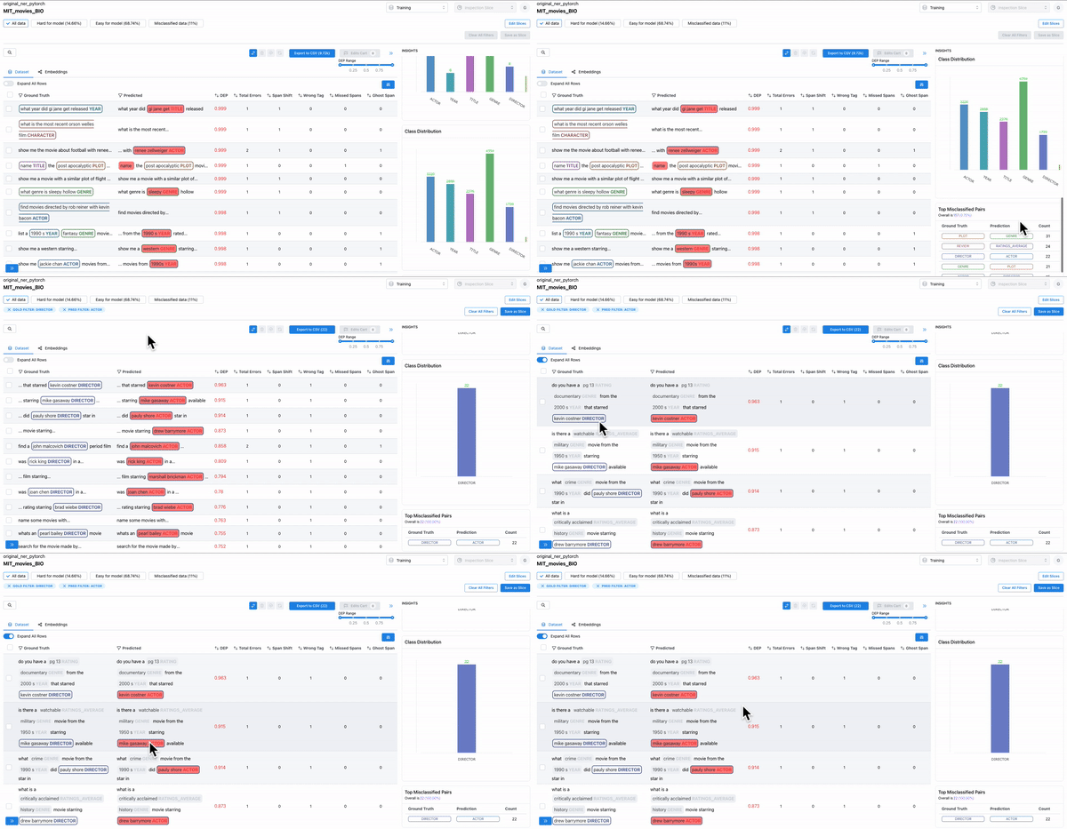
Most frequent erroneous words across spans
As shown in Figure 3, the insights panel provides top erroneous words across all spans in the dataset. These words have the highest average DEP across spans, and should be further inspected for error patterns. Example: “rated” had high DEP because it was inconsistently labelled as “RATING_AVERAGE” or “RATING” by the annotators.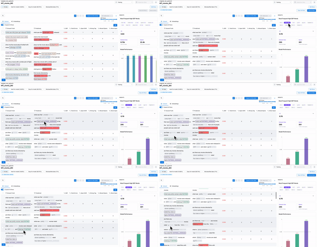
Error patterns for least performing class
As shown in Figure 4, the model performance charts can be used to identify and filter on the least performing class. The erroneously annotated spans surface to the top.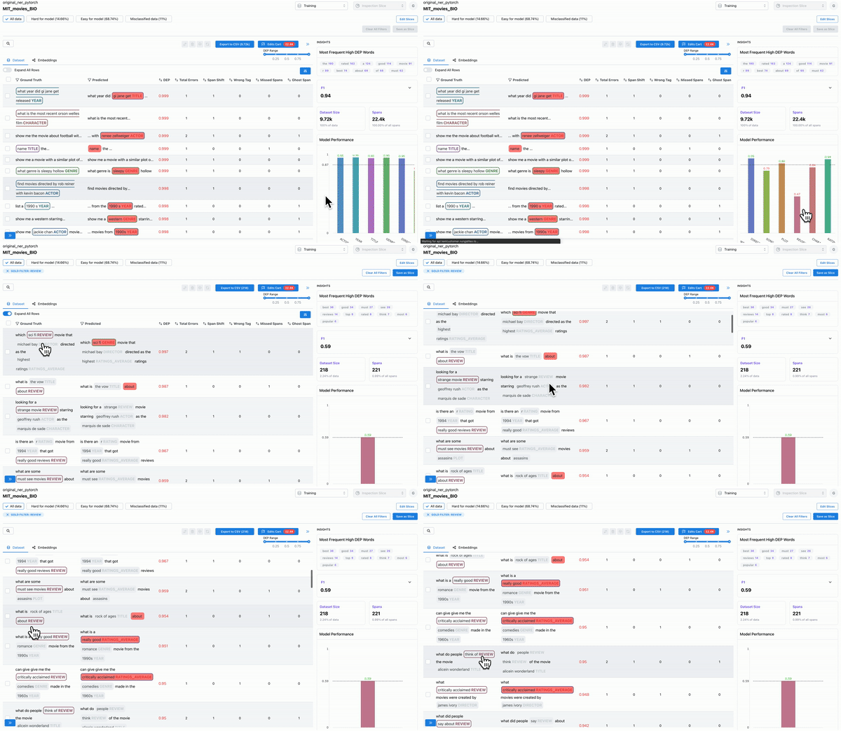
Hard spans for the model
As shown in the Figure 5, the “color-by” feature can be used to observe predicted embeddings, and see the spans that are present in ground truth data, but were not predicted by the model. These spans are hard for the model to predict on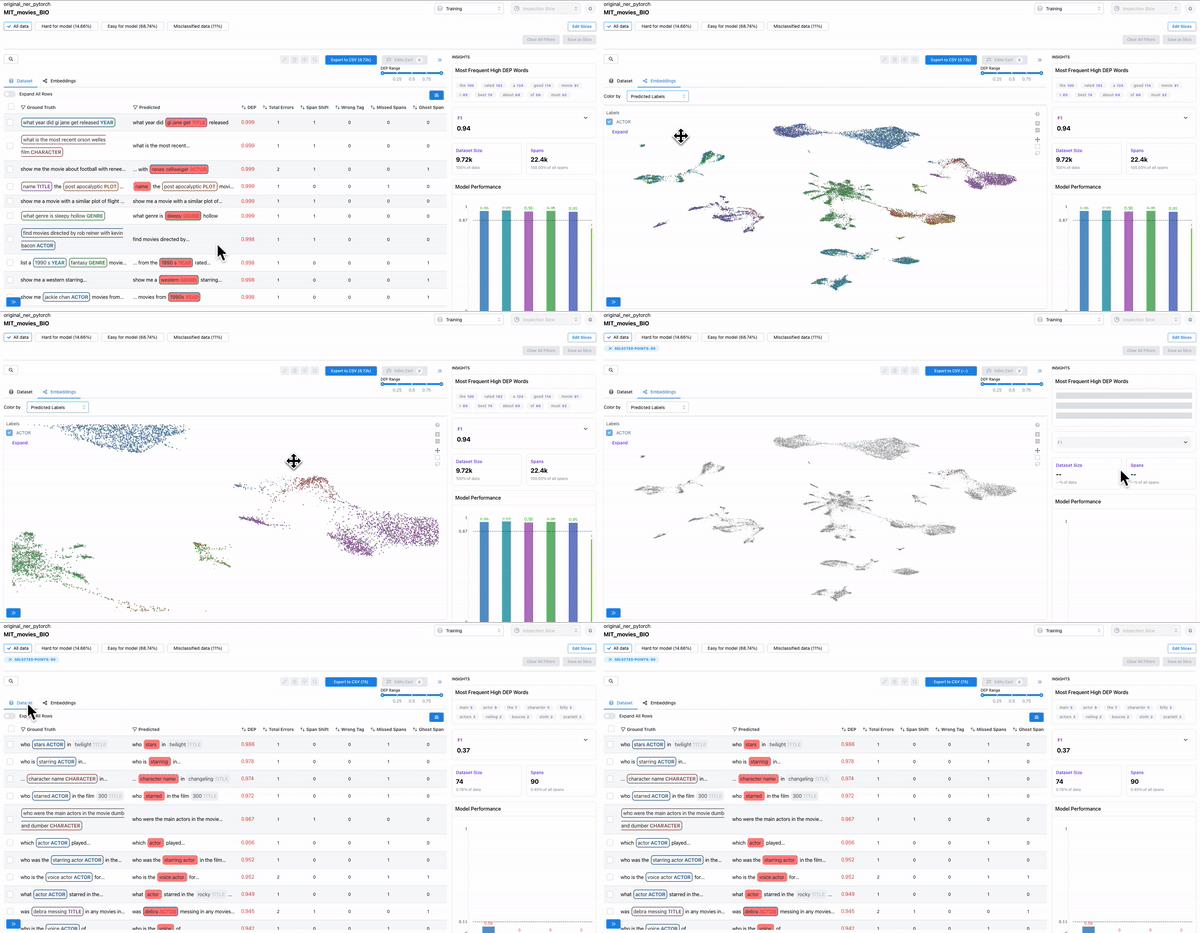
Confusing spans
As shown in Figure 6, the error distribution chart can be used to identify which classes have highly confused spans, where the span class was predicted incorrectly. Sorting by DEP and wrong tag error can help surface such confusing spans.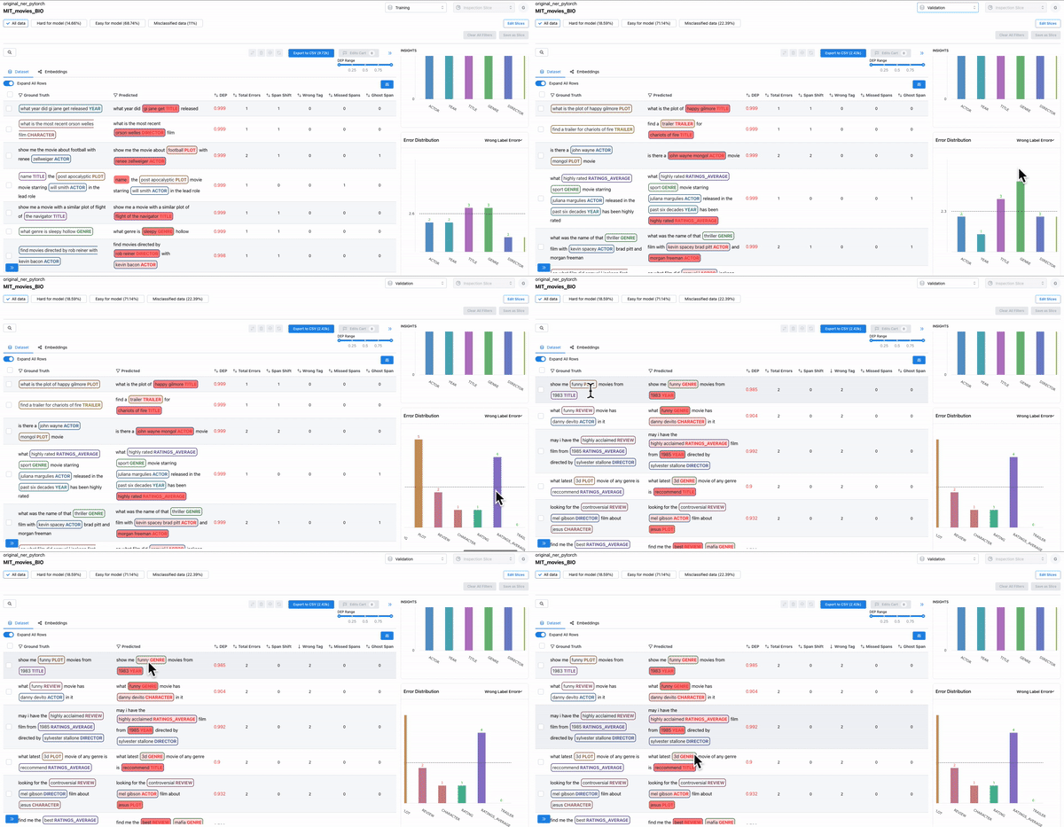
Smart features: to find malformed samples
As shown in Figure 7, the smart features from Galileo allow one to quickly find ill-formed samples. Example: Adding text length as a column and sorting based on it will surface malformed samples.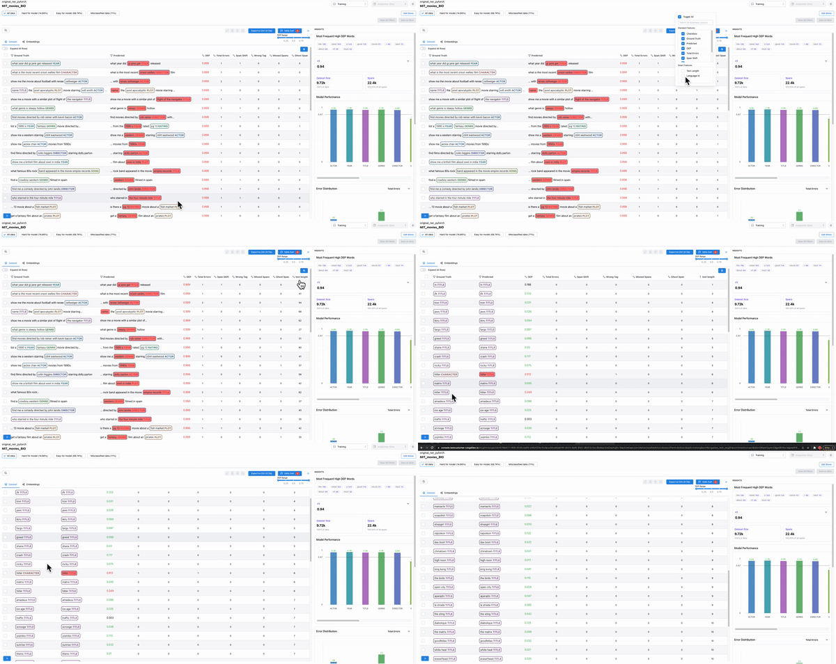
Get started with a notebook
Start integrating Galileo with our supported frameworks
- PyTorch
- TensorFlow
- Spacy
Technicalities
- Required format for logging data